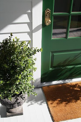
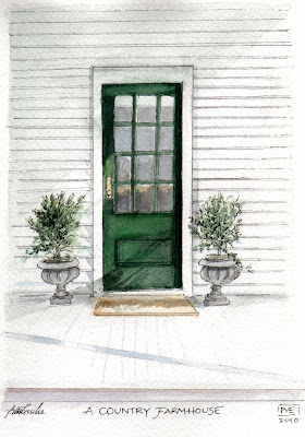
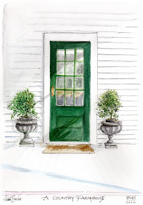
 I happened upon this home and I decided to let myself in. There was something about the green door that left me wanting more. The light, the cast shadows, the planter, the brass door knob and the panes of glass caught my eye.
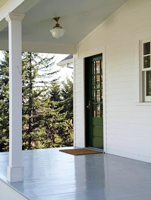
Around the other side is another green door. I want to know who lives here and what is on the other side of that door.
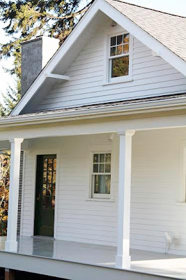
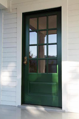
I knocked and the door opened.
I walked in, sat down in a wonderful chair and began to paint ( my paints go with me everywhere) but the paper felt too cold.
(Arches Paper - 140 Lb. cold-pressed, 100 % cotton)
I then tried this paper, and the paper felt just right to me.
(Arches Paper - 140 Lb. hot-pressed, 100% cotton)
So, tell me, do you have a preference of paper, the cold-pressed or the hot-pressed paper.
The cold-pressed paper has a more traditional water colour wavy texture to it, while the hot-pressed has a flat, satin smooth finish.
Excuse me while I go upstairs and check out the beds for a wee nap.
I have a feeling I will find just the right spot.
(Trina, thanks for allowing me to illustrate your green door and for stalking such
a country farmhouse as yours, just right. I have a feeling I will feel compelled to illustrate each and every room and taste every bowl of porridge too.)

43 comments:
Such an inviting setting! Just love your last version of it, it reflects the sun in the panes! Wonderful!
Just right!
Have a wonderful week of early spring...
XO
Victoria
They are both amazing! If I had to choose, but only if I HAD to, it would be the hot pressed...the sun feels warmer to me shining on the door. Never really paid attention to this type of thing before, great learning something new!
Gorgeous! I love green doors! I love them both but fav is hot press. Have a wonderful Monday!
Victoria, Zhush and Frau-
You ladies and your comments are always so wonderfully spot on!
Happy Monday.
pve
Both pieces look great...I think I like the one on the hot pressed better a smidge better. Have a fantastic day! xx
Good morning, PVE.
The porridge was "just right" on the second illustration. Making the simple simply beautiful.
Have a great one.
b
I am always so surprised of your drawings! Love them so much! I found a blog that maybe you will be interested in.The author is a girl from France and she is making wonderful aquarelles. The blog is called Céline Chollet Aquarelles. http://wwwboitedaquarelles.blogspot.com.
xx
Greet
I love the first photo and what your illustration my friend. I would have loved to take a walk down the halls of this home with you. xo
Love this Goldilocks post! The light fixture on the front porch caught my eye. The second illustration strikes my fancy, though!
I enjoyed this story of the house with green door to go along with the painting.
Cold pressed paper has texture that gives it another interesting element to water color paintings.
Both beautiful!
They are both just right-but that sun in the secnd illustration is warming and casting a lovely shadow. I love the clean lines of this home.
What a darling home! I love the green door---so classic. Both of your paintings are lovely---hot or cold, they both seem just right : )
XO Katie
I love painting on Arches HP best, but I have to say - I think I prefer your first painting on the CP! It is wonderful.
Fun story too!!
Have a great week.
~Dana
goldilocks with paints-should get you in every time. Both are just right.pgt
The paper does make a difference. Love the green door.
Such a perfect shade of green!
LOVE the green door - very reminiscent of the 1930s. I think I like the cold pressed better but both are great!
Patricia, it depens, I work a lot on canvas as you kow, on paper sometimes I like the texture and sometimes I like the Bristol smooth feel.
Karena
Arr by Karena
OOps, it is early for my....
Art by Karena
You're always most welcome here Patricia...and the porridge will always be waiting...and warm. Love your story and your beautiful work. I like both papers, but perhaps the hot pressed paper a bit more because of its warmth and brightness. xoxo Trina
Gorgeous drawing PVE!! I adore Trina's sweet farmhouse.
I think I like the hot pressed. I love the drawing either way.
Perfect. I love how they look so clean and simple, even though they aren't. Beautiful work, love her blog too!
Trina's beautiful farmhouse is indeed worthy of your lovely paintings! I love them both!
joan
You captured my favorite farmhouse perfectly.
~janet
Ah- beautiful. I love Trina's house. Great job!
Yes, a green door beckons one to come in and stay a while... Both illustrations are beautiful, my favorite is the second. It is bright and cheery like my mood today!
Beautiful and inspiring. We have a "new" old farmhouse and I love the feel of your painting. It could have been my house! Lovely!
Yvonne
The hot vibrates with life & warmth. Just delicious.
I too am in love with Trina's house! They are both wonderful, but I love the 2nd piece!
Just beautiful viewing your inspiration all the way to your finished painting!
We had a green door in our previous house and it looked really nice. Love your drawing of the door!
I would want to go in that door too, there is something about it that is very welcoming!
Hi P:
Ok, to my untrained eye, I love how you caught the sunlight dapples in illustration #2!
But hey--both are lovely!
Thank you for sharing your visit with us. I can't wait to see what you do with Trina's lovely interiors!
: )
Julie M.
Perfect and charming in every way! wonderful job, and I loved the story line!
I like the warm version - though both look very good. What a sweet little farmhouse. The green door put there probably just for you.
I've just come to know this pretty farmhouse. I enjoyed your charming story and lovely interpretation.
It's gorgeous!! Right now I need to sunshine - even if only the reflection of it. xoxo
This story is so intriguing. You're amazing.
OH how I love your blog. I love your art and style too. I must hit your follower button so I can return often.
It's nice to meet you through your words and art.
Lee Ann
I like the cold one better.
Post a Comment